
Top Gothic, Serif, Sans Serif, and Script Fonts for Professional Design
Introduction
Typography plays a vital role in every successful design project. The right font can make a brand look modern, elegant, creative, or trustworthy within seconds. Whether you are designing a website, logo, brochure, business card, or social media graphic, your font choice directly affects how people perceive your work. With thousands of fonts available online, choosing the right one can feel overwhelming. Each font style has its own personality and purpose. Some fonts are perfect for corporate branding, while others work better for creative projects or luxury products. Understanding the differences between Gothic, Serif, Sans Serif, and Script fonts helps designers make better decisions and create visually appealing designs. Instead of selecting fonts based only on appearance, professionals choose typography that supports the message and improves readability. This guide explores the top Gothic, Serif, Sans Serif, and Script fonts for professional design in 2026. You will also learn where each font style works best and how to combine them effectively.
Why Font Choice Matters
Fonts are more than decorative elements. They shape the way people experience a design and influence how information is understood. A well-chosen font can improve readability, strengthen brand identity, and create a professional appearance. Poor typography, on the other hand, can make even an excellent design look unpolished.
Professional designers carefully consider the audience, industry, and purpose before selecting typography. A technology company often prefers clean Sans Serif fonts, while a luxury brand may rely on elegant Serif typography to communicate quality and tradition. Choosing the right font also improves consistency across websites, presentations, advertisements, and printed materials.
Understanding the Four Main Font Categories
Before selecting a typeface, it is important to understand the characteristics of each font family.
| Font Style | Best Used For | Personality |
| Gothic | Posters, logos, gaming, fashion | Bold and dramatic |
| Serif | Books, branding, editorial design | Classic and trustworthy |
| Sans Serif | Websites, apps, presentations | Modern and clean |
| Script | Invitations, luxury branding, signatures | Elegant and creative |
Each category serves a different purpose. Matching the font style to your project helps create a stronger visual impact.
Best Gothic Fonts for Bold Designs
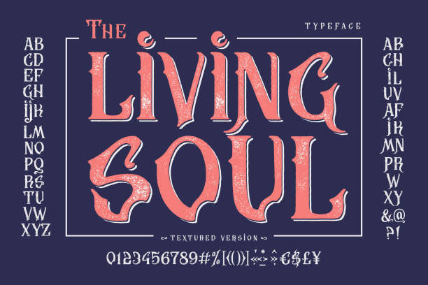
Gothic fonts are recognised for their bold appearance and distinctive character. While traditional Gothic typography reflects medieval influences, many modern Gothic fonts combine dramatic styling with improved readability. These fonts work well for branding that aims to stand out. They are commonly used in fashion campaigns, music artwork, gaming graphics, posters, and premium logos. Popular Gothic fonts include Old English Text MT, Blackletter, Deutsch Gothic, Cloister Black, and Kingthings Foundation. Each offers a unique style while maintaining the bold personality associated with Gothic typography. Although Gothic fonts attract attention, they should be used carefully. Large headings and logos are ideal, but long paragraphs become difficult to read when written entirely in this style.
Best Serif Fonts for Professional Branding
Serif fonts remain one of the most trusted choices for professional communication. Their small decorative strokes at the ends of letters improve readability in printed content and create a timeless appearance. Many newspapers, publishing houses, universities, and law firms continue to use Serif fonts because they communicate credibility and authority. Some of the most popular Serif fonts include Times New Roman, Georgia, Garamond, Baskerville, Playfair Display, and Merriweather. These typefaces perform well in both digital and print environments. Serif fonts are particularly effective for annual reports, editorial layouts, magazines, books, luxury branding, and premium product packaging. They also pair well with clean Sans Serif fonts for modern website designs.
Best Sans Serif Fonts for Modern Design
Sans Serif fonts remove the decorative strokes found in Serif typography, creating a cleaner and more minimal appearance. Their simplicity makes them one of the most popular choices for websites, mobile applications, software interfaces, and corporate branding. Modern technology companies frequently choose Sans Serif fonts because they remain highly readable across different screen sizes.
Some of the best Sans Serif fonts include Helvetica, Roboto, Inter, Open Sans, Montserrat, Lato, and Poppins. These fonts are widely available and supported across multiple design platforms. Their versatility allows designers to use them for headings, body text, presentations, marketing materials, and user interfaces without sacrificing readability.
Best Script Fonts for Elegant Projects
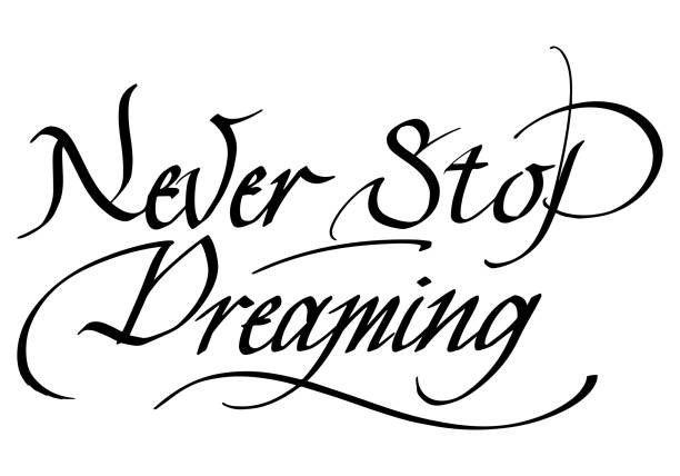
Script fonts imitate natural handwriting or calligraphy, giving designs a personal and sophisticated appearance. They are often used to create emotional connections and highlight premium products or special occasions. Popular Script fonts include Great Vibes, Allura, Pacifico, Alex Brush, Sacramento, and Dancing Script. Each offers a distinctive style that works well for invitations, wedding stationery, beauty brands, restaurant menus, and luxury packaging. While Script fonts add elegance, they should be used sparingly. They work best for headlines, logos, and short phrases rather than lengthy paragraphs, where readability becomes more challenging.
Choosing the Right Font for Your Project
Selecting the perfect typeface depends on your audience and design goals.
- Use Gothic fonts for bold branding, gaming, fashion, and creative posters.
- Choose Serif fonts for editorial design, books, luxury brands, and corporate identities.
- Select Sans Serif fonts for websites, mobile apps, technology companies, and presentations.
- Apply Script fonts to invitations, premium branding, and decorative headings.
Using fonts intentionally creates stronger visual communication and improves the overall user experience.
Tips for Pairing Different Font Styles
Using a single font throughout a design can work well, but combining complementary fonts often creates a more balanced and engaging layout. The key is to maintain contrast without sacrificing consistency. A common approach is to use one font for headings and another for body text. For example, pairing a bold Serif heading with a clean Sans Serif body creates a professional look while keeping content easy to read. Avoid mixing too many font families in one project. Using two, or at most three, complementary fonts is usually enough to create visual hierarchy and maintain a consistent design.

Common Font Pairings Designers Love
| Heading Font | Body Font | Best For |
| Playfair Display | Open Sans | Blogs and magazines |
| Merriweather | Lato | Business websites |
| Garamond | Montserrat | Luxury branding |
| Bebas Neue | Roboto | Posters and marketing |
| Great Vibes | Poppins | Wedding and event designs |
| Oswald | Inter | Landing pages |
These combinations provide excellent contrast while maintaining readability across digital and print projects.
Where to Find High-Quality Fonts
Thousands of fonts are available online, but choosing trusted sources helps ensure quality and proper licensing. Reliable font websites also offer filters for style, language support, and commercial usage. Some of the best platforms include Google Fonts, Adobe Fonts, Font Squirrel, DaFont, and FontSpace. These websites provide a wide range of free and premium fonts suitable for branding, websites, presentations, and print projects. Before downloading any font, always review its licence. Some fonts are free only for personal use, while others allow commercial projects without restrictions.
Common Typography Mistakes to Avoid
Even experienced designers can make typography mistakes that reduce the impact of their work. Paying attention to readability and consistency helps create more polished designs.
- Using too many different fonts in one project.
- Choosing decorative fonts for long paragraphs.
- Ignoring spacing between letters and lines.
- Using fonts that do not match the brand personality.
- Forgetting to check commercial licensing before publishing.
Avoiding these mistakes improves readability and creates a more professional appearance.
Typography Trends in 2026
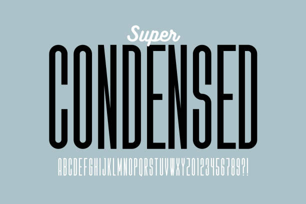
Typography continues to evolve alongside modern design trends. Designers are moving towards cleaner layouts while experimenting with expressive display fonts for branding and advertising. Variable fonts are becoming increasingly popular because they offer greater flexibility without increasing website loading times. Responsive typography is also essential, ensuring fonts remain readable across desktops, tablets, and smartphones. Another growing trend is combining classic Serif headings with modern Sans Serif body text. This pairing balances tradition and innovation, making it suitable for many industries. Minimalist typography, generous white space, and accessibility-focused font choices are also shaping professional design in 2026.
Conclusion
Choosing the right typography is one of the most important decisions in any design project. Fonts influence readability, brand identity, and the overall impression your work leaves on viewers. Understanding when to use Gothic, Serif, Sans Serif, and Script fonts allows designers to create layouts that communicate the right message while maintaining visual balance. Each font category offers unique strengths, making it suitable for different industries and creative goals. The top Gothic, Serif, Sans Serif, and Script fonts featured in this guide provide excellent starting points for professional projects in 2026. Whether you are building a website, designing a logo, creating marketing materials, or developing a brand identity, selecting the right typography will help your work stand out. As typography trends continue to evolve, focus on readability, consistency, and purposeful font pairing. These principles will help you produce designs that are both visually appealing and highly effective.
Frequently Asked Questions
Which font style is best for professional branding?
Serif and Sans Serif fonts are the most popular choices for professional branding because they offer excellent readability and create a trustworthy appearance.
Are Gothic fonts suitable for websites?
Gothic fonts are best used for headings, logos, and decorative elements. They are generally not recommended for long blocks of website text.
Why are Sans Serif fonts popular in UI and UX design?
Sans Serif fonts are clean, easy to read on digital screens, and maintain clarity across different devices and screen sizes.
When should I use Script fonts?
Script fonts work best for invitations, luxury branding, beauty products, signatures, and creative headlines where elegance is important.